
Bitcoin charts are similar to the 2021 top: Will history rhyme?

Bitcoin’s price chart is starting to mimic the pattern it displayed when it reached the previous cycle’s all-time high of $69,000 in November 2021, according to a crypto trader.
Other traders argued that charts don’t tell the full story now, amid mounting demand for Bitcoin from crypto treasury companies.
Bitcoin charts look similar to 2021, trader says
Technical analysts often compare Bitcoin’s price chart to similar patterns in past cycles to figure out when the price might peak, when to sell and when money may start rotating into other assets.
“Has anyone else noticed that the topping price action in 2021 looks exactly the same as current price action?” crypto trader Nebraskangooner said in an X post on Thursday, pointing to a chart showing what appeared to be a double top pattern often viewed by traders as bearish.
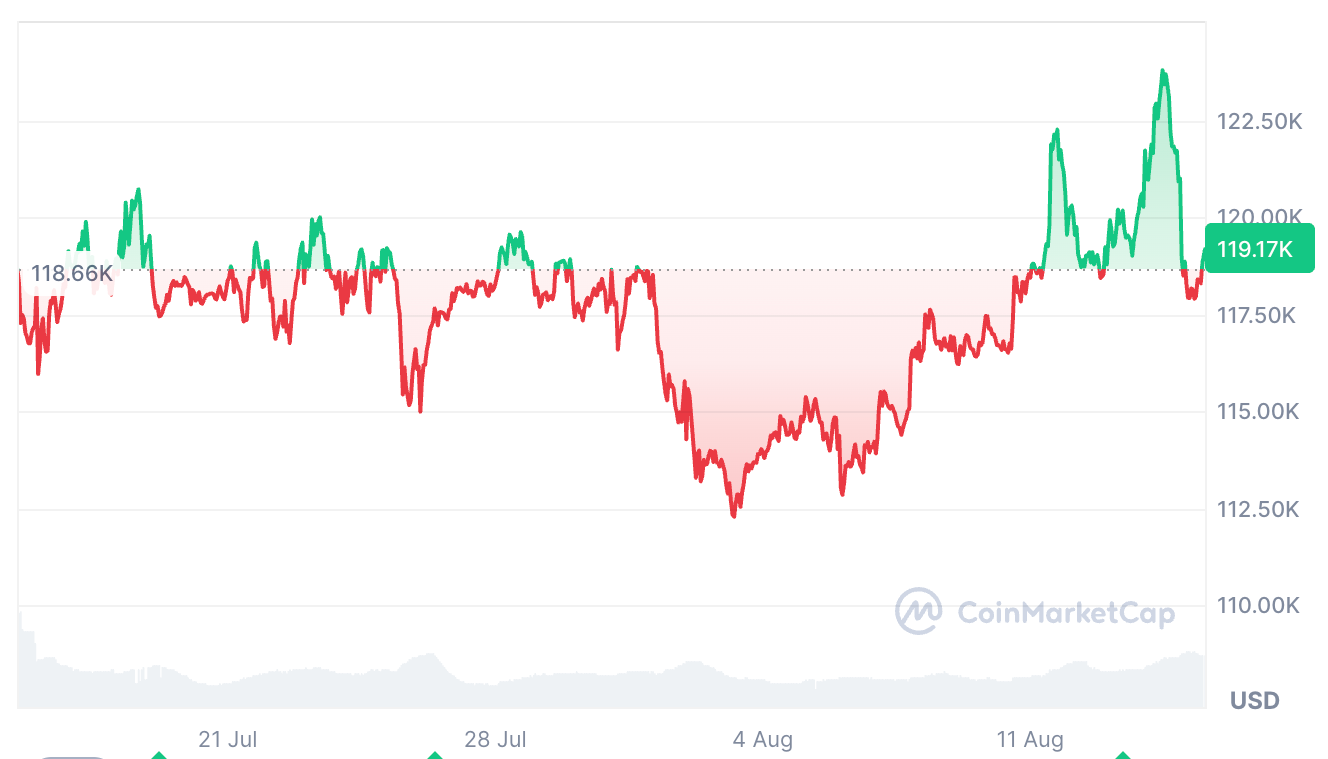 Bitcoin has fallen 4.3% over the past 24 hours, after reaching a new all-time high of $124,100 on Thursday. Source: CoinMarketCap
Crypto analyst Benjamin Cowen agreed, suggesting that the Bitcoin chart tracks the same pattern each post-halving year.
“Up in July-Aug. Down in Sep. Up into the market cycle top in Q4. Bear Market,” he said.
Traders using charts to predict prices are “fooling themselves”
Still, crypto trader Kale Abe said Nebraskangooner’s observation was “another instance where charts and fractals don’t matter.”
“The only thing that matters is the treasury companies and if they are out of ammo or not,” Kale Abe said. BitcoinTreasuries.Net data shows that $150.98 billion worth of Bitcoin has been scooped up by publicly traded Bitcoin treasury companies.
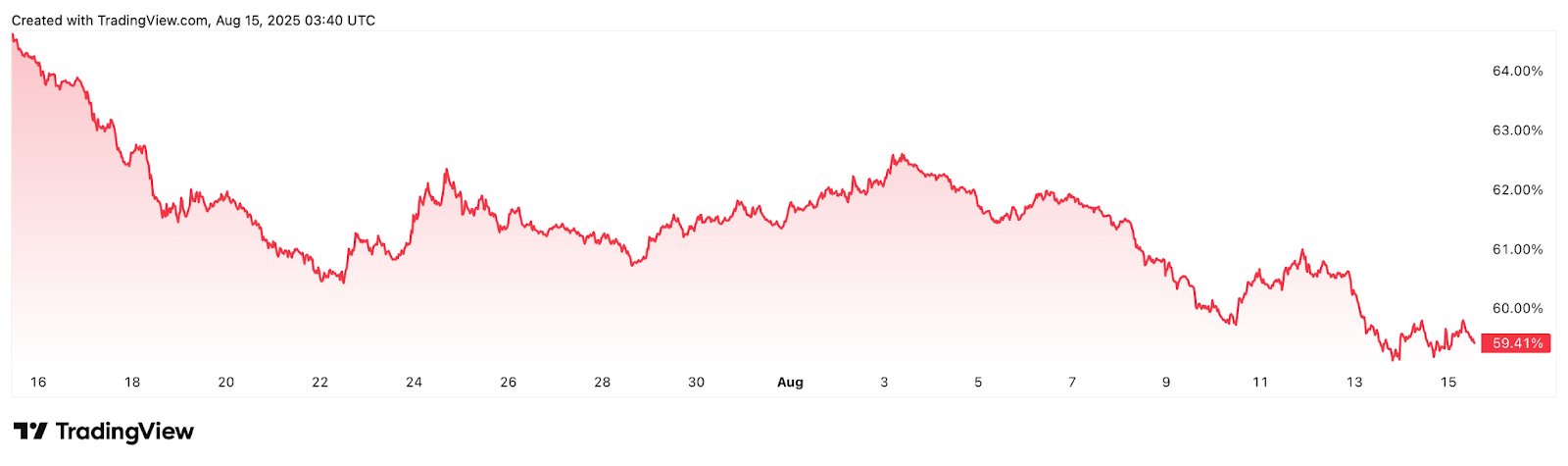 Bitcoin dominance, which measures Bitcoin’s overall market share, fell 6.55% over the past 30 days. Source: TradingView
Abe also doubted that Bitcoin would go “into a bear market” as Ether is nearing its all-time highs. “Impossible,” he said. Ether is up 19% over the past seven days, trading at $4,612, about 5.75% below its 2021 all-time highs of $4,878.
It comes just a few weeks after veteran trader Peter Brandt told Cointelegraph Magazine , “Anyone that looks at the charts and tries to tell you where anything is going is actually just kind of fooling themselves.”
Brandt said the only real use of a price chart is seeing where the price has been and where it is now.
Disclaimer: The content of this article solely reflects the author's opinion and does not represent the platform in any capacity. This article is not intended to serve as a reference for making investment decisions.
You may also like
The S&P 500 ends its longest calm period in over six years, falling more than 1% for the first time in 53 trading days as AI trading loses momentum
The main reason for the decline in US stocks on Wednesday was the combination of higher-than-expected US September CPI and AI credit risk shocks. This downturn was particularly unfavorable for quantitative funds, as these funds have continued to increase their positions during a period of extremely low volatility, and the breaking of the calm period triggered adjustment pressure on their holdings. Currently, the decline remains moderate, with the VIX hovering around 17, below the typical 20 threshold indicating market stress.
Australia Unemployment Rate set to remain at a five-year high of 4.6% in September

Blackstone's AirTrunk Postpones $1.5 Billion REIT IPO: Yield Raised to 6% but No Takers, AI Infrastructure Financing Faces 5.2% US Treasury Yield
AirTrunk, a data center operator under Blackstone, has decided to postpone the listing of its $1.5 billion Singapore Real Estate Investment Trust (REIT) to the first or second quarter of 2027. Rising U.S. Treasury yields and increased market volatility have made investors more cautious; even raising the yield from 5.5% to around 6% has not boosted demand. High capital costs are becoming a major constraint on the expansion of AI infrastructure.
Crypto prices
More


